Python __getattr__ and __getattribute__ magic methods
2021-06-06Machine Learning Interview: Basics
2021-06-17Introduction to advanced candlesticks in finance: tick bars, dollar bars, volume bars, and imbalance bars
In this article, we will explore why traditional time-based candlesticks are an inefficient method to aggregate price data, especially under two situations: (a) highly volatile markets such as cryptocurrencies and (b) when using algorithmic or automatic trading. To prove this point, we will analyze the behavior of the Bitcoin-USD historical price, we will look at why markets do not follow sunlight cycles anymore and why the type of data we use can be an advantage with respect to competitors. Finally, we will briefly introduce alternative and state-of-the-art price aggregation methods, such as volume or tick imbalance bars, that aim to mitigate the shortcomings of traditional candlesticks.
Over-sampling and under-sampling in highly volatile markets
Cryptocurrency markets are extremely volatile. Prices change rapidly and are rather common to see the price moving sideways for hours before being pumped or dumped 5-20% in a matter of minutes. While long-term trading strategies may be still profitable while ignoring the intra-day volatility, any strategy in the middle or short term (not to mention high-frequency trading) will necessarily have to address the issue of volatility in one way or another.
In the following plot, we analyze the volatility of the Bitcoin-US dollar pair from March 2013 until April 2019 for the Bitfinex exchange (data obtained from CryptoDatum.io) using 5-minute candlesticks. Specifically, we show:
(1) the histogram of absolute price changes (calculated as the percentage of change of the close price with respect to the open price)
(2) the proportion of candles at the right of the histogram from a specific point (red line)
(3) the proportion of the total amount of price change produced by the candles at the right (green line).
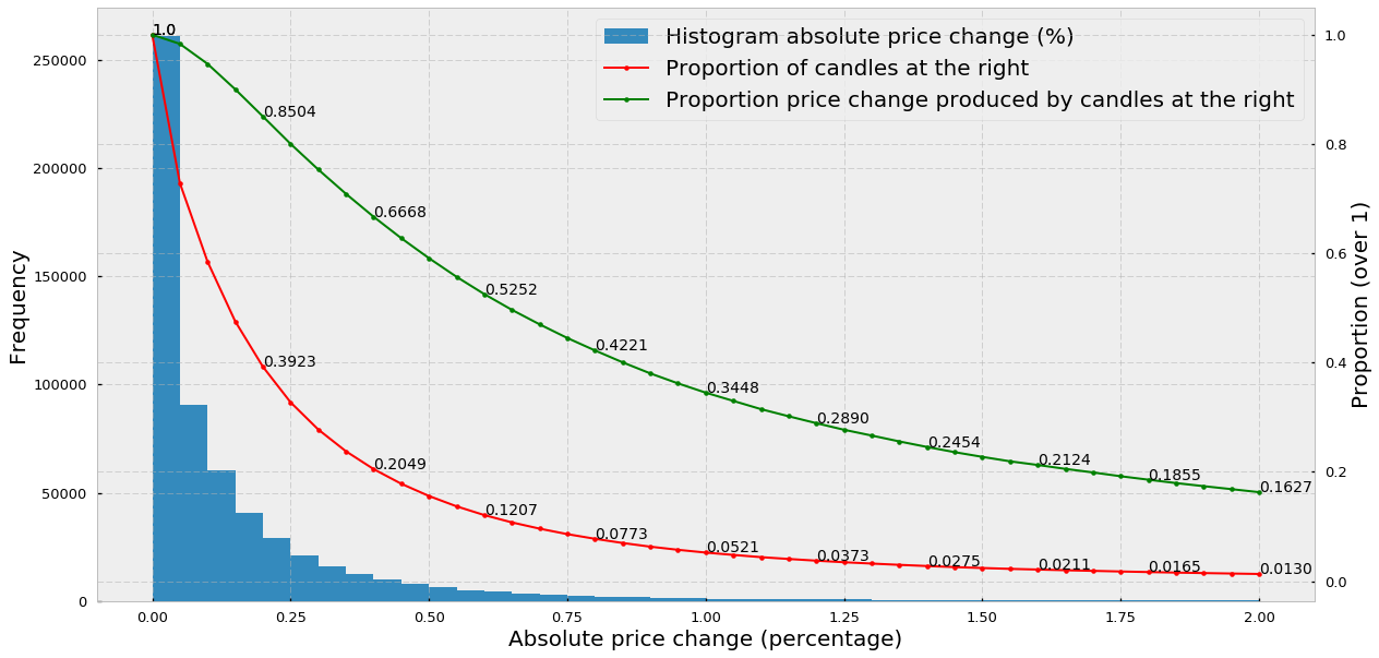
Thus, we can observe that:
- The majority of 5-minute candles (around 70%) experience price changes below 0.25%, with the largest part of them experiencing virtually no price change (first histogram peak at 0.00–0.05%).
- 20% (0.2049) of the candlesticks explain almost 67% (0.6668) of the total amount of price change.
- 2% of the candlesticks explain 21% of the total amount of the price change, indicating that in 2% of the BTC-USD candlesticks huge price variations occurred in the short time frame of 5 minutes (high volatility).
What we can conclude from point 1 is that time-based candlesticks clearly over-sample periods of low activity (activity understood as price change). In other words, in 70% of the candlesticks, nothing is really going on so the question is: if we want to train an ML-based algorithm, do we need all these candles where no change is observed? Would finding a way to remove or discard most of the meaningless candles be useful to enrich our datasets?
Time-based candlesticks over-sample low activity periods and under-sample high activity periods
On the other hand, points 2 and 3 indicate that most of the price changes happen in a small percentage of candlesticks suggesting that time-based candlesticks under-sample high activity periods. What this means is that if the price changes 10% in 5 minutes and we are using 5-minute candlesticks, our algorithm will not be able to see anything happening between the opening and the closing of the time-based candlestick, potentially missing a good trading opportunity. Therefore, ideally, we would like to find a way to sample more candles whenever market activity increases and sample fewer candles when market activity decreases.
Markets probably do not follow human daylight cycles anymore
The main reason why we are using time-based candlesticks is that we humans live embedded in time and, therefore, time is something we find tremendously convenient to organize ourselves and synchronize our biological rhythms with. Furthermore, the sunlight cycle is of utmost importance for humans because it determines the awake-asleep cycle, which is of biological relevance for our survival. As a consequence of the daylight cycle, traditional stock exchanges still open at 9:30 AM (so that actual humans can trade while they are awake) and close at 4 PM (so that traders can sleep in peace — but… do they?).
With the advent of technology, automatic trading bots have started to displace real human traders and, particularly in cryptocurrencies, markets no longer follow the daylight cycle since they remain open 24/7. In these circumstances, does it make sense to keep using time-based candlesticks, a mere standard, consequence of human convenience? López de Prado summarizes it well in his book Advances in Financial Machine Learning:
Although time bars are perhaps the most popular among practitioners and academics, they should be avoided. […] Markets do not process information at a constant time interval. […] As biological beings, it makes sense for humans to organize their day according to the sunlight cycle. But today’s markets are operated by algorithms that trade with loose human supervision, for which CPU processing cycles are much more relevant than chronological intervals
Everyone’s data is no one’s advantage
The reason why most good trading algorithms are a well-kept secret is that money is made when from an out-of-equilibrium situation we can anticipate going to another equilibrium. And, generally speaking, equilibrium means everyone is already aware of what’s going on and there are enough positive and negative forces to keep the newly reached equilibrium in balance.
In order to anticipate a change in equilibrium, we must be contrarian and correct at the same time: this is, we must know something that the rest doesn’t know and be correct in our assertion. We must find out-of-equilibria that the majority of other traders are unaware of, otherwise, we would be already in equilibrium again. It is often referred to as a “zero-sum” game, although I don’t particularly like this definition.
Everyone’s data is no one’s advantage
In order to be contrarian, we must look at the data and analyze it in new creative ways that allow us to gain certain advantages and respect others. Here’s when small details such as the type of data we use to train our algorithms can make a big difference. In practice, this means that if everyone uses time-based candlesticks, why would we use the same as everyone else? If a minoritarian and better alternative may exist, why would we still use time-based candlesticks?
Alternative candlesticks
A few times I felt more enlightened than after reading the first chapters of de Prado’s book Advances in Financial Machine Learning. In his book, this experienced fund manager reveals common practices and mathematical tools he has been using to manage multimillionaire funds for more than 20 years. Particularly, he knows that the behavior of markets has changed dramatically over the years and that competing with trading bots is rather the rule than the exception. In this context, de Prado describes several alternative types of candlesticks that aim to replace the traditional time-based candlesticks and that bring the necessary creativity and novelty to the financial space.
Here are some examples of alternative candlesticks or bars proposed by de Prado:
- Tick bars: we sample a bar every time a predefined number of transactions — i.e. trades — takes place. For instance, every time 200 trades take place in the exchange, we sample an OHLCV bar by calculating its Open-High-Low-Close-Volume values.
- Volume bars: we sample a bar every time a predefined volume is exchanged. For instance, we create a bar every time 10 Bitcoins are traded in an exchange.
- Tick Imbalance bars: We analyze how imbalanced is the sequence of trades and we sample a bar every time the imbalance exceeds our expectations.
Tick bars
In this section, we will learn how to build tick bars, we will thoroughly analyze their statistical properties such as normality of returns or autocorrelation and we will explore in which scenarios these bars can be a good substitute for traditional time-based candlesticks. In order to illustrate the applicability of tick bars in the forecasting of cryptocurrency markets, we will base our analysis on a whole dataset comprising 16 cryptocurrency trading pairs including the most popular crypto-assets such as Bitcoin, Ethereum, or Litecoin.
In the previous section, we explored why traditional time-based candlesticks are not the most suitable price data format if we are planning to train a machine learning (ML) algorithm. Here is the list:
(1) time-based candlesticks over-sample low activity periods and under-sample high activity periods.
(2) markets are increasingly controlled by trading algorithms that no longer follow any human-related daylight cycle.
(3) the use of time-based candlesticks is ubiquitous among traders and trading bots, which increases the competition.
and, as we will see in the next section
(4) time-based candlesticks offer poorer statistical properties.
Building tick bars
There are at least two main definitions of what a tick is. Quoting Investopedia:
A tick is a measure of the minimum upward or downward movement in the price of a security. A tick can also refer to the change in the price of a security from trade to trade.
In the case of tick bars, the definition we care about is the second one: in the scope of tick bars, a tick is essentially a trade and the price at which the trade was made in the exchange. A tick bar or a tick candle is simply the aggregation of a predefined number of ticks. For instance, if we want to generate 100-tick bars we must keep a store of all trades, and every time we “receive” 100 trades from the exchange we build a bar or candlestick. Candlesticks are then built by calculating the Open, High, Low, Close, and Volume values (they are usually shortened to OHLCV).
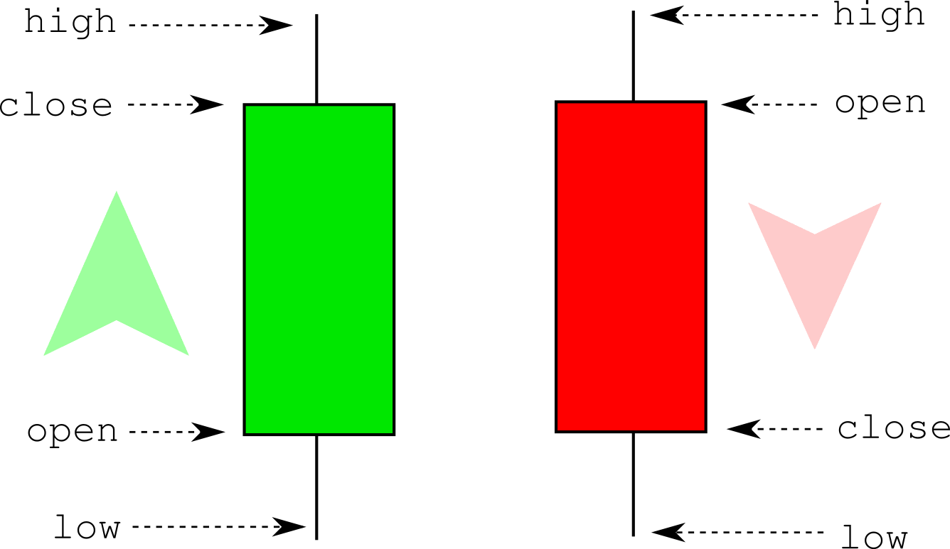
The open and close values correspond to the price of the first and last trade, respectively. The high and the low are the max and min prices of all the trades in the candle (may overlap with the open and close). Finally, the volume is the sum of all exchanged assets (for instance in the ETH-USD pair, the volume is measured as the number of Ethereums exchanged during the candle). The convention is that when a candle closes at a higher price than its open price we color them green (or keep it empty) while if the close price is lower than the open price we then color them red (or filled with black). Here’s a very simple but fast Python implementation to generate tick candlesticks:
# expects a numpy array with trades
# each trade is composed of: [time, price, quantity]
def generate_tickbars(ticks, frequency=1000):
    times = ticks[:,0]
    prices = ticks[:,1]
    volumes = ticks[:,2]
    res = np.zeros(shape=(len(range(frequency, len(prices), frequency)), 6))
    it = 0
    for i in range(frequency, len(prices), frequency):
        res[it][0] = times[i-1]                        # time
        res[it][1] = prices[i-frequency]               # open
        res[it][2] = np.max(prices[i-frequency:i])     # high
        res[it][3] = np.min(prices[i-frequency:i])     # low
        res[it][4] = prices[i-1]                       # close
        res[it][5] = np.sum(volumes[i-frequency:i])    # volume
        it += 1
    return res
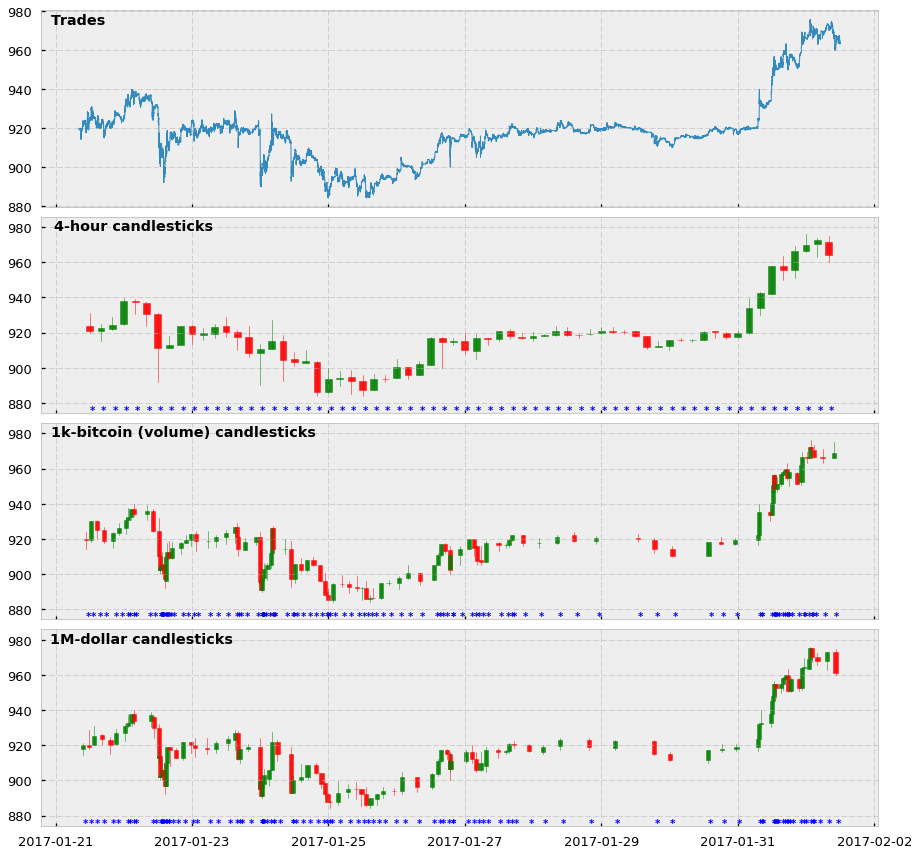
And here is a visualization of how the tick bars look in comparison to standard time-based candlesticks. In this case, we show 4-hour and 1000-tick bars for the BTC-USD trading pair, as well as the price of all trades comprised between 01-21-2017 and 02-20-2017. Notice that for the candlesticks we also show an asterisk every time we sample a bar.
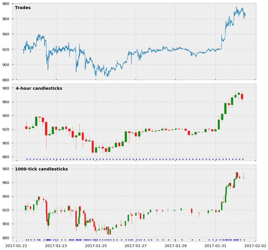
Two main observations about these plots:
- Yes, tick candlesticks look very ugly. They are chaotic, overlapped, and hard to understand but remember they are not supposed to be human-friendly: they are supposed to be machine-friendly.
- The actual reason why they are ugly is that they are doing very well in their job. Look at the asterisks, and see how in periods in which the price changes a lot there are more asterisks (and more bars) cluttered together. And the opposite: when the price does not change much, tick bar sampling is much lower. We are essentially creating a system in which we are synchronizing the arrival of information to the market (higher activity and price volatility) with the sampling of candlesticks. We are finally sampling more in periods of high activity and sampling less in periods of low activity. Hooray!
Statistical properties
So what about their statistical properties? Are they any better than their traditional time-based counterparts?
We’ll be looking at two different properties: (1) serial correlation and (2) normality of returns for each of the 15 cryptocurrency pairs offered in CryptoDatum.io, including all historical bars of the Bitfinex exchange, and for each of the time-based and tick candle-stick sizes:
- Time-based bar sizes: 1-min, 5-min, 15-min, 30-min, 1-hour, 4-hour, 12-hour, 1-day.
- Tick bar sizes: 50, 100, 200, 500, 1000
1) Serial correlation (a.k.a. auto-correlation)
Serial correlation measures how much each value of a time series is correlated with the following one (for lag=1) or between any value i and any other value i+n (lag=n). In our case, we will calculate the serial correlation of the log returns, which are calculated as the first difference of the log of candles’ close prices.
def returns(candles_close_prices):
    return np.diff(np.log(candles_close_prices))
Ideally, each data point of our series should be an independent observation. If a serial correlation exists it means that they are not independent (they depend on each other at lag=1 or higher) and this will have consequences when building regressive models because the errors we will observe in our regression will be smaller or bigger than the true errors, which will mislead our interpretations and predictions. You can see a very visual explanation of the problem here.
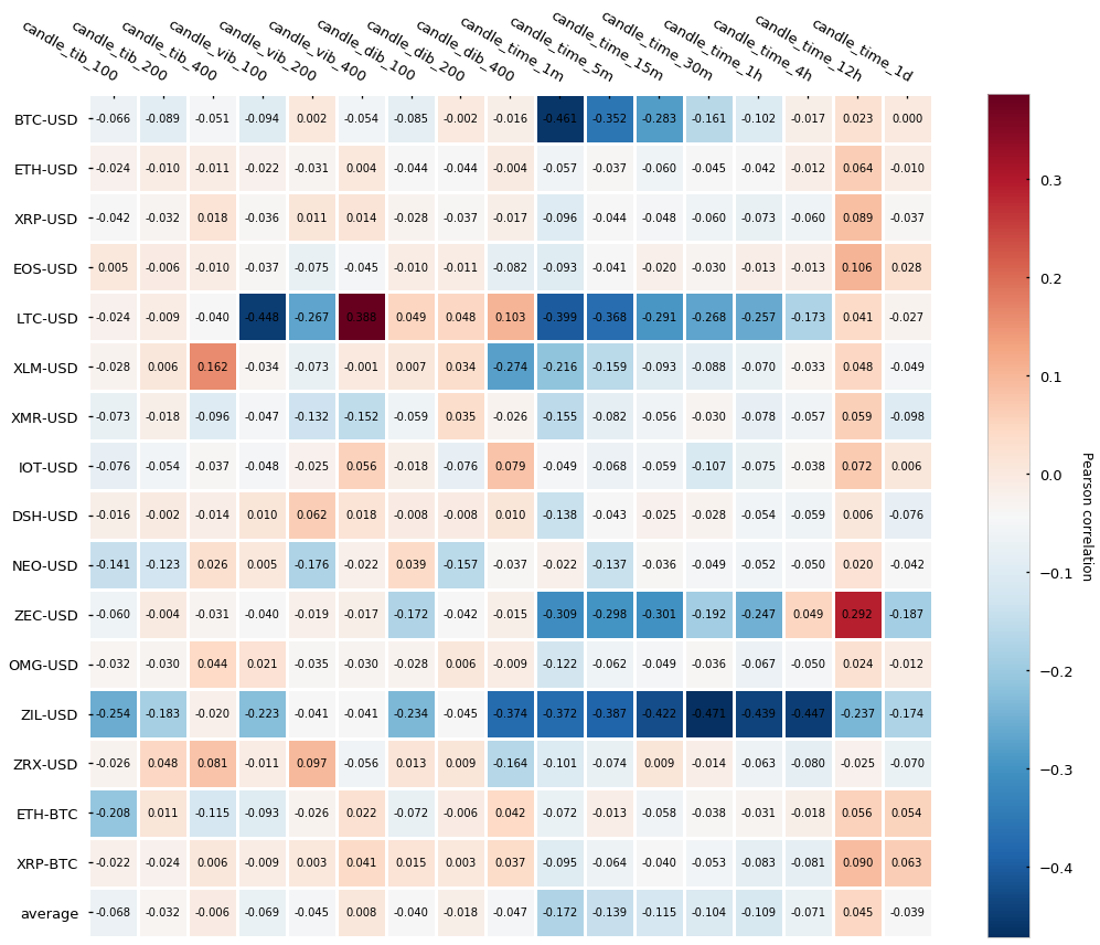
In order to measure the serial correlation, we will calculate the Pearson correlation of the series concerning the shifted self (lag=1, a.k.a. first-order correlation). Here are the results:
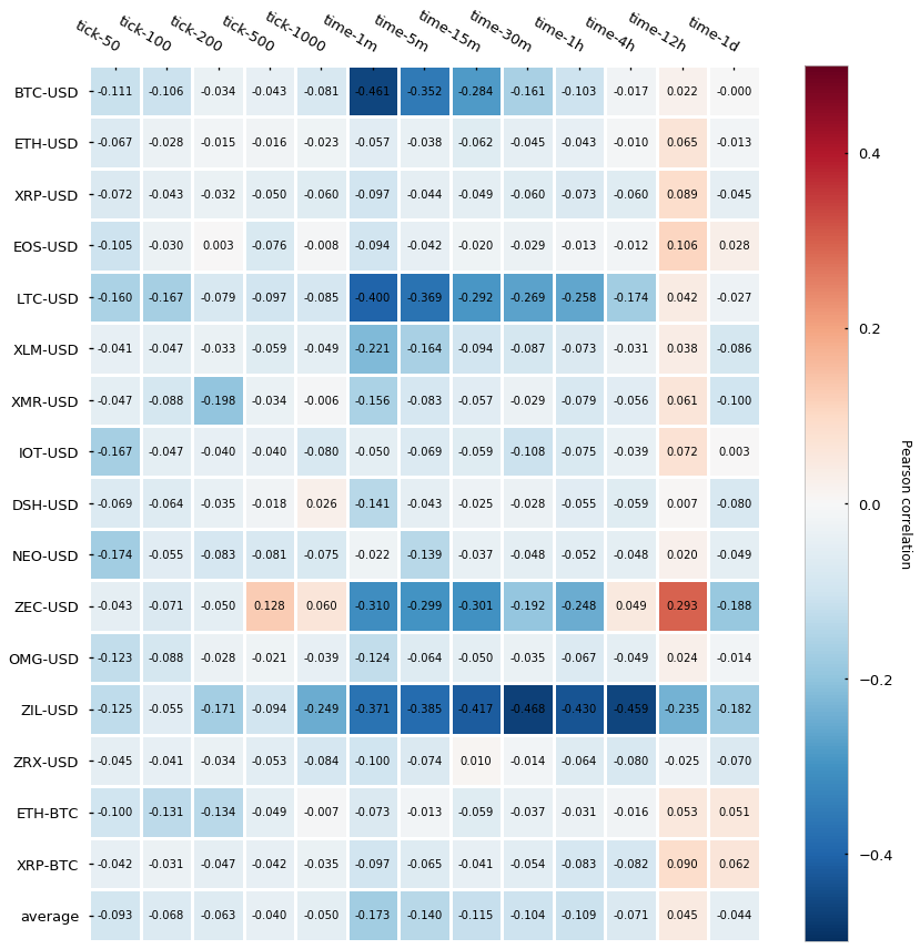
It turns out that tick bars (labeled as tick-*) have generally lower auto-correlation than time-based candlesticks (labeled as time-*) — this is, the Pearson auto-correlation is closer to 0. The difference seems to be less evident for the bigger time bars (4h, 12h, 1d) but interestingly even the smallest tick bars (50-tick and 100-tick) yield a very low auto-correlation, which does not hold true for the smaller time bars (1-min, 5-min). Finally, is interesting to see how several cryptocurrencies (BTC, LTC, ZEC, and ZIL) express fairly strong negative auto-correlation in a few of the time-bars. Roberto Pedace comments here about negative auto-correlations:
Autocorrelation, also known as serial correlation, may exist in a regression model when the order of the observations in the data is relevant or important. In other words, with time-series (and sometimes panel or logitudinal) data, autocorrelation is a concern. […] No autocorrelation refers to a situation in which no identifiable relationship exists between the values of the error term. […] Although unlikely, negative autocorrelation is also possible. Negative autocorrelation occurs when an error of a given sign tends to be followed by an error of the opposite sign. For instance, positive errors are usually followed by negative errors and negative errors are usually followed by positive errors.
We will perform an additional statistic test called the Durbin-Watson (DB) test that also diagnoses the existence of serial correlation. The DB statistic lies in the 0–4 range and its interpretation is the following:
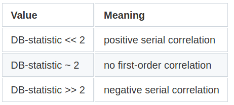
Essentially, the closest to 2, the lowest the serial correlation is. Here are the results:
Results are in line with the Pearson autocorrelation test, which gives strength to the narrative that tick bars display a slightly lower autocorrelation than time-based candlesticks.
2) Normality of returns
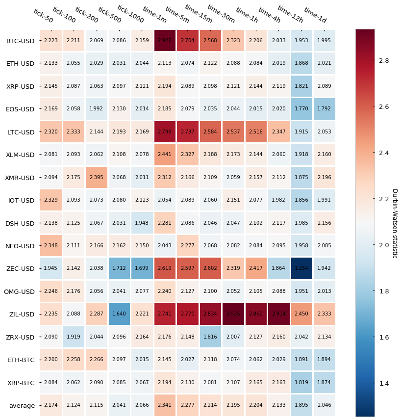
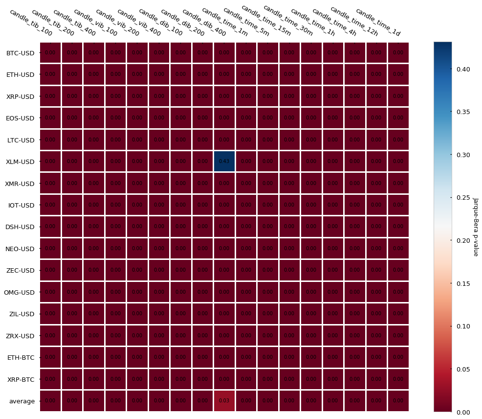
Another statistic we can look at is the normality of returns, this is whether the distribution of our log-returns follows or not a normal (a.k.a Gaussian) distribution. There are several tests we can run to check the normality — we will perform 2 of them: the Jarque-Bera test, which tests whether the data has skewness and kurtosis matching a normal distribution, and the Shapiro-Wilk test, which is one of the most classical tests to check if a sample follows a Gaussian distribution. In both cases, the null hypothesis is that the sample follows normality. If the null hypothesis is rejected (p-value lower than the significance level — usually < 0.05) there is compelling evidence that the sample does not follow a normal distribution. Let’s look at the p-values for the Jarque-Bera first:
The results are almost unanimous: log-returns do not follow a Gaussian distribution (most p-values < 0.05). Two cryptocurrency pairs (Stellar and Zilliqa) seem to actually follow a Gaussian if we set our significance level at 0.05. Let’s take a look at their distributions (kernel density estimates):
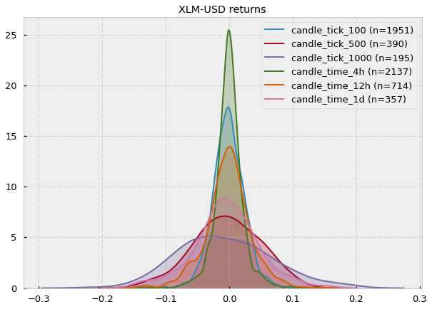
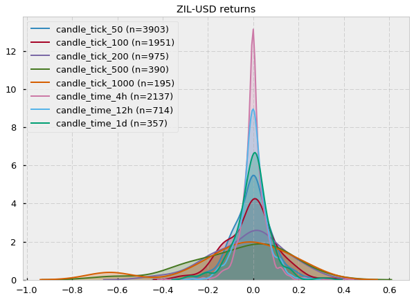
Fair enough, some of them could look Gaussian (at least visually). However, notice that the number of samples (n) is very small (e.g. for XLM-USD candle_tick_1000 n=195) so I suspect that one of the reasons may just be the lack of sampling, which provides Jarque-Bera not enough evidence to reject the null hypothesis of normality. A quick look at the CryptoDatum.io database shows that XLM-USD and ZIL-USD trading pairs were just released in May and July last year (2018), respectively, and they seem to have quite a low volume. Mystery solved? Let’s now run the Shapiro-Wilk test to see if it agrees with the previous results:
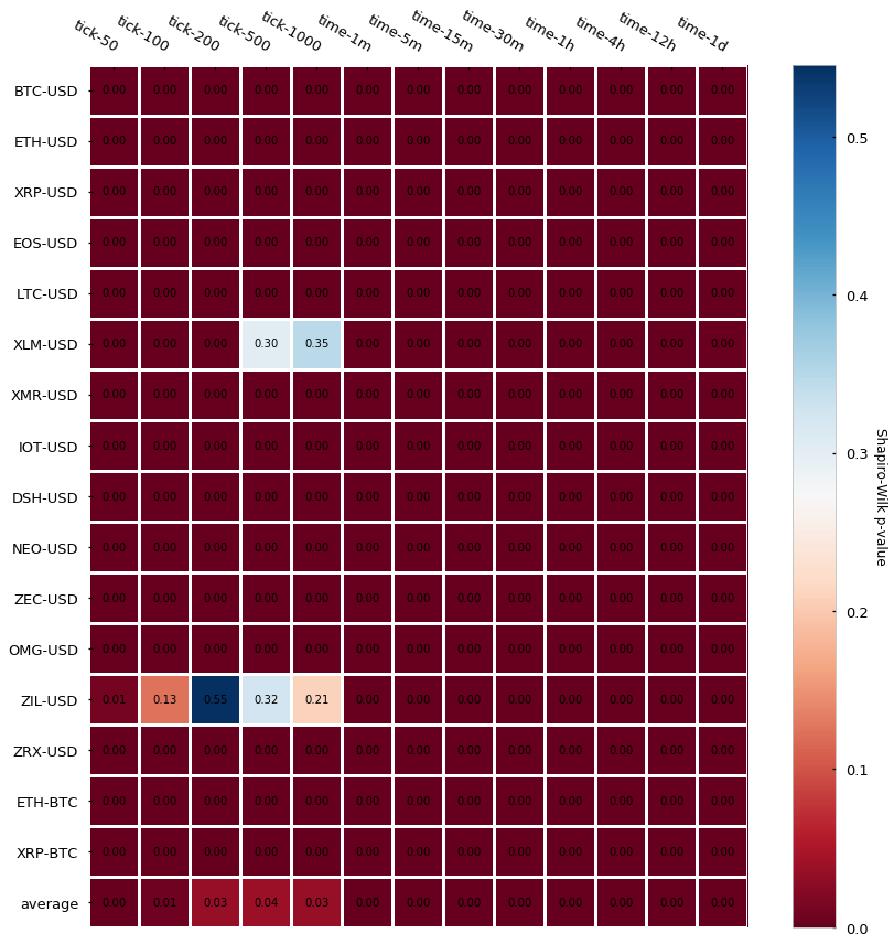
Damn, Shapiro, didn’t they teach you not to copy during a test at school? Non-normality of returns seems to be the rule regardless of bar type.
What did we learn so far?
- Tick candlesticks are generated by aggregating a predefined number of ticks and calculating the associated OHLCV values.
- Tick bars look ugly in a chart but they do their job well: they sample more during high activity periods and sample less during low activity periods.
- Log returns from tick candlesticks display lower serial correlation when compared to time-based candlesticks, even at small sizes (50, 100-tick bars).
- Log returns from both tick and time-based bars do not follow a normal distribution.
Dollar and Volume Bars
In this section, we will learn how to build volume and dollar bars and we will explore what advantages they offer with respect to traditional time-based candlesticks and tick-bars. Finally, we will analyze two of their statistical properties – autocorrelation and normality of returns – in a large dataset of 16 cryptocurrency trading pairs.
Similar to tick bars, volume and dollar bars also allow the synchronization of the sampling rate with the activity of the market, but each of them understands the concept of activity in a different way. In the case of tick bars, market activity is defined as the number of trades that take place in the exchange. Volume bars define activity as the number of assets traded in the exchange, for instance, the number of Bitcoins exchanged. For dollar bars, activity is defined as fiat value exchanged, for instance, sample a bar every time 1000$ in assets are exchanged, which can be measured in dollars but also in Euro, Yen, etc. Therefore, each bar type understands and synchronizes to market activity differently and this differential understanding brings its advantages and disadvantages. Let’s dig into them.
Advantages and disadvantages of tick, volume, and dollar bars
With the tick bars, we found a way to scan the trade history of an exchange and sample more bars simply when more trades were executed in the exchange. While a strong correlation between the number of trades placed and information arrival may exist, the correlation is not guaranteed. For instance, a well-acquainted algorithm or trader may automatically place very small, repetitive orders to influence the sentiment of the market (by turning the trade history “green”), to hide the total amount of volume (also known as iceberg orders), or simply to disorient other trading bots by falsifying information arrival.
A potential solution to this scenario is to use volume bars instead. Volume bars do not care about the sequence or number of trades, they just care about the total volume of these trades. For them, information arrival is increased volume traded between the exchange users. This way, volume bars are able to bypass misleading interpretations of the number of trades being executed at the cost of losing any information that could lie hidden in the actual sequence of trades.
Another interesting feature about volume bars, which may sound obvious but is important to notice, is that market volume information is intrinsically coded on the bar themselves: each volume bar is a bucket of a predefined volume. Again, this may sound obvious, but for a long time, and still today, lots of researchers in the financial space are clueless about how to include the volume information in their predictive models. Volume bars yield volume information out-of-the-box.
Now, the problem with the volume bars is that volume exchanged may be very correlated with the actual value of the asset being exchanged. For instance, with 10,000 dollars you could buy around 10 bitcoins in early 2017, but by the end of 2017, you could only buy half a bitcoin with it. That massive fluctuation of the underlying value greatly undermines the power of volume bars because a volume size that is relevant at some point in time may not be relevant in a near future due to the revaluation of the asset. A way to correct for this fluctuation is by, instead of counting the number of assets exchanged (volume bars), counting the quantity of fiat value exchanged (dollar bars), which happens to be in dollars for the BTC-USD pair, but could also be in Euros for the ETH-EUR pair, etc.
Building volume and dollar bars
Now that we have seen the strengths and weaknesses of each bar type, let’s look at how can we actually build them. Here’s a fast Python implementation to build volume bars:
import numpy as np

# expects a numpy array with trades
# each trade is composed of: [time, price, quantity]
def generate_volumebars(trades, frequency=10):
    times = trades[:,0]
    prices = trades[:,1]
    volumes = trades[:,2]
    ans = np.zeros(shape=(len(prices), 6))
    candle_counter = 0
    vol = 0
    lasti = 0
    for i in range(len(prices)):
        vol += volumes[i]
        if vol >= frequency:
            ans[candle_counter][0] = times[i]                          # time
            ans[candle_counter][1] = prices[lasti]                     # open
            ans[candle_counter][2] = np.max(prices[lasti:i+1])         # high
            ans[candle_counter][3] = np.min(prices[lasti:i+1])         # low
            ans[candle_counter][4] = prices[i]                         # close
            ans[candle_counter][5] = np.sum(volumes[lasti:i+1])        # volume
            candle_counter += 1
            lasti = i+1
            vol = 0
    return ans[:candle_counter]
And here is an implementation for dollar bars, which only includes a few small modifications to the previous function. let’s see if you can spot them:
import numpy as np

# expects a numpy array with trades
# each trade is composed of: [time, price, quantity]
def generate_dollarbars(trades, frequency=1000):
    times = trades[:,0]
    prices = trades[:,1]
    volumes = trades[:,2]
    ans = np.zeros(shape=(len(prices), 6))
    candle_counter = 0
    dollars = 0
    lasti = 0
    for i in range(len(prices)):
        dollars += volumes[i]*prices[i]
        if dollars >= frequency:
            ans[candle_counter][0] = times[i]                          # time
            ans[candle_counter][1] = prices[lasti]                     # open
            ans[candle_counter][2] = np.max(prices[lasti:i+1])         # high
            ans[candle_counter][3] = np.min(prices[lasti:i+1])         # low
            ans[candle_counter][4] = prices[i]                         # close
            ans[candle_counter][5] = np.sum(volumes[lasti:i+1])        # volume
            candle_counter += 1
            lasti = i+1
            dollars = 0
    return ans[:candle_counter]
Finally, here’s how they look compared to traditional time-based candlesticks:
Volume and dollar-based candles are similar to the tick bars in the sense that, while it is true that they look chaotic and overlapped when compared to the harmonic time-based ones, they do their job well at sampling whenever there is a change in market activity.
Statistical analysis of volume bars
Let’s now look at their statistical properties. We’ll be looking at the serial correlation of returns by performing the Pearson auto-correlation test and the Durbin-Watson test. Finally, we will also look at the normality of the results by performing the Jarque-Bera and Shapiro-Wilk tests. Refer to this article about tick bars to learn more about these statistical tests.
In the case of volume bars, we will be showing results on 16 trading pairs and for 7 volume sizes each (labeled as tier1 to tier7). Unlike tick bars, the sizes of the volumes are cryptocurrency-specific since they depend on multiple factors such as the total amount of coins in circulation, underlying asset value, etc. The way we selected the volume sizes for each cryptocurrency was by calculating the mean volume exchanged per day and then by dividing the daily mean volume by the same ratios as 5min, 15min, 30min, 1h, 4h, 12h correspond to 1d, and rounded to the nearest 10. Here are the automatically chosen volumes per cryptocurrency pair:
|        |     t1 |     t2 |      t3 |      t4 |      t5 |       t6 |       t7 |
|:-------|-------:|-------:|--------:|--------:|--------:|---------:|---------:|
| BTCUSD |     80 |    200 |     500 |    1000 |    4000 |    10000 |    20000 |
| DSHUSD |     40 |    100 |     200 |     500 |    2000 |     6000 |    10000 |
| EOSUSD |  20000 |  70000 |  100000 |  200000 | 1000000 |  3000000 |  7000000 |
| ETHBTC |    200 |    600 |    1000 |    2000 |   10000 |    30000 |    60000 |
| ETHUSD |    600 |   1000 |    3000 |    7000 |   30000 |    90000 |   100000 |
| IOTUSD |  60000 | 100000 |  300000 |  700000 | 3000000 |  9000000 | 10000000 |
| LTCUSD |    400 |   1000 |    2000 |    4000 |   10000 |    50000 |   100000 |
| NEOUSD |   1000 |   3000 |    6000 |   10000 |   50000 |   100000 |   300000 |
| OMGUSD |   2000 |   8000 |   10000 |   30000 |  100000 |   400000 |   800000 |
| XLMUSD |   4000 |  10000 |   20000 |   50000 |  200000 |   600000 |  1000000 |
| XMRUSD |    100 |    300 |     600 |    1000 |    4000 |    10000 |    20000 |
| XRPBTC |  40000 | 100000 |  200000 |  400000 | 1000000 |  5000000 | 10000000 |
| XRPUSD | 100000 | 500000 | 1000000 | 2000000 | 8000000 | 20000000 | 50000000 |
| ZECUSD |     50 |    100 |     300 |     600 |    2000 |     7000 |    10000 |
| ZILUSD |    500 |   1000 |    3000 |    6000 |   20000 |    80000 |   100000 |
| ZRXUSD |   2000 |   7000 |   10000 |   20000 |  100000 |   300000 |   700000 |
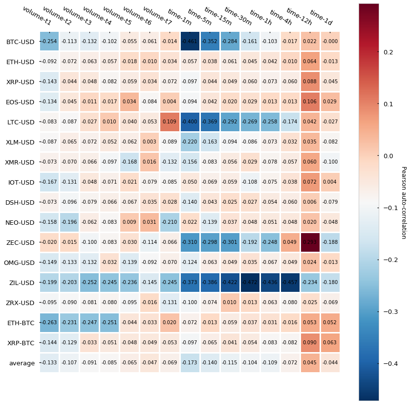
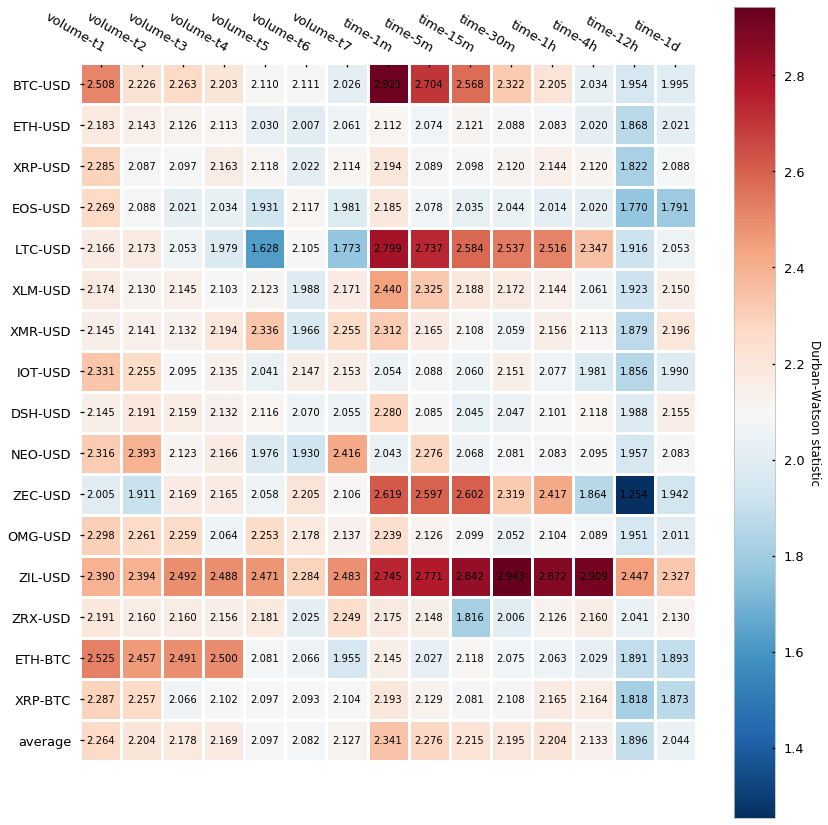
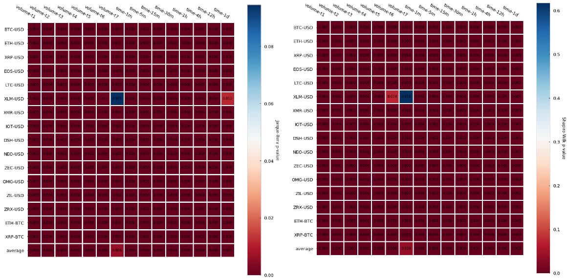
Results are in line with what we saw with tick bars. Volume bars show slightly less auto-correlation in comparison to time-based candlesticks and the null hypothesis of normality is rejected in most cases in both normality tests so we have certainty that returns do not follow a Gaussian distribution.
Statistical analysis of dollar bars
We’ll repeat the previous tests for autocorrelation and normality of returns. In the case of the dollar bars, the dollar bar sizes (expressed in $) are defined as in the next table:
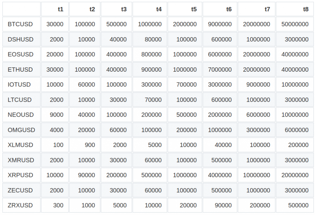
Table 2. CryptoDatum.io dollar bar sizes ($)
Let’s look now at the normality and autocorrelation tests results:
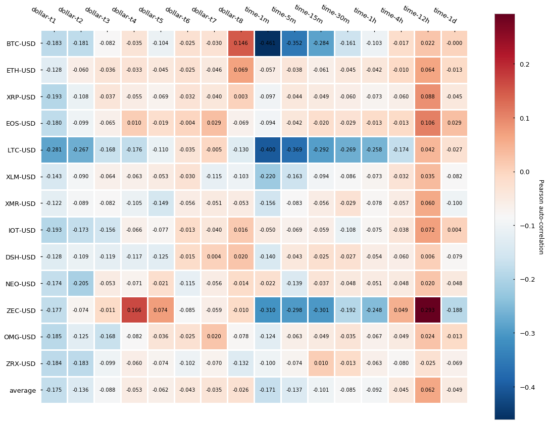
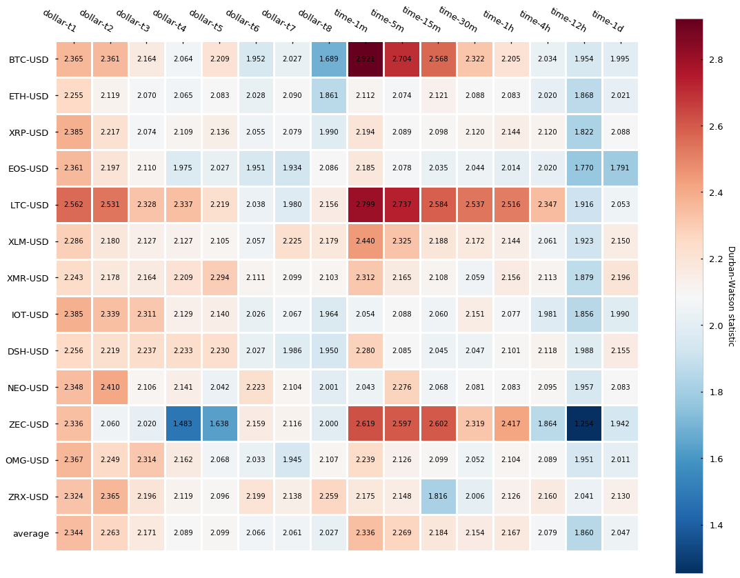
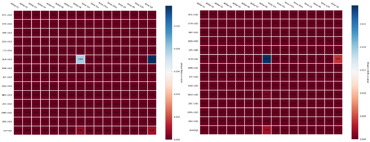
The results, contrary to what we have seen for both tick and volume bars is that dollar bars in fact show little improvement in terms of autocorrelation when compared to time-based candlesticks. We can observe a slightly lower autocorrelation variance across different cryptocurrencies but little differences can be seen on average. Finally, returns normality is widely rejected again.
Intra-candle price variation analysis
We have said that tick, volume, and dollar bars sampling adapt to the market activity and allow us to sample more in high activity periods and sample less in low activity periods. Ultimately, this property should be reflected in the amount of price change inside a single candle. The idea is that time-based candlesticks sample at fixed time intervals regardless of the market activity while the alternative bars get synchronized with market activity. Therefore, seems intuitive that time-based candlesticks should have both candles with little price change (periods of oversampling) and candles with high price change (periods of undersampling), while alternative bars should be more equilibrated.
However, what do we understand as a market activity? Can a market be very active and the price moves sideways? The answer is yes, while generally there’s a correlation between high market activity and big price change this relationship is not guaranteed. For instance, there are cases in which high FUD (fear, uncertainty, and doubt) can provoke a big spike in volume but little price change. Also wash trading is definitely not uncommon in cryptocurrency markets. These moves involve self-trading (the buyer and the seller are the same people), which again provokes huge spikes of volume with little price change.
In order to clear this matter out, let’s look at the distributions of intra-candle price variation for each of the types of bars. Intra-candle price variation has been calculated as:
intra-candle variation = (high-low)/high
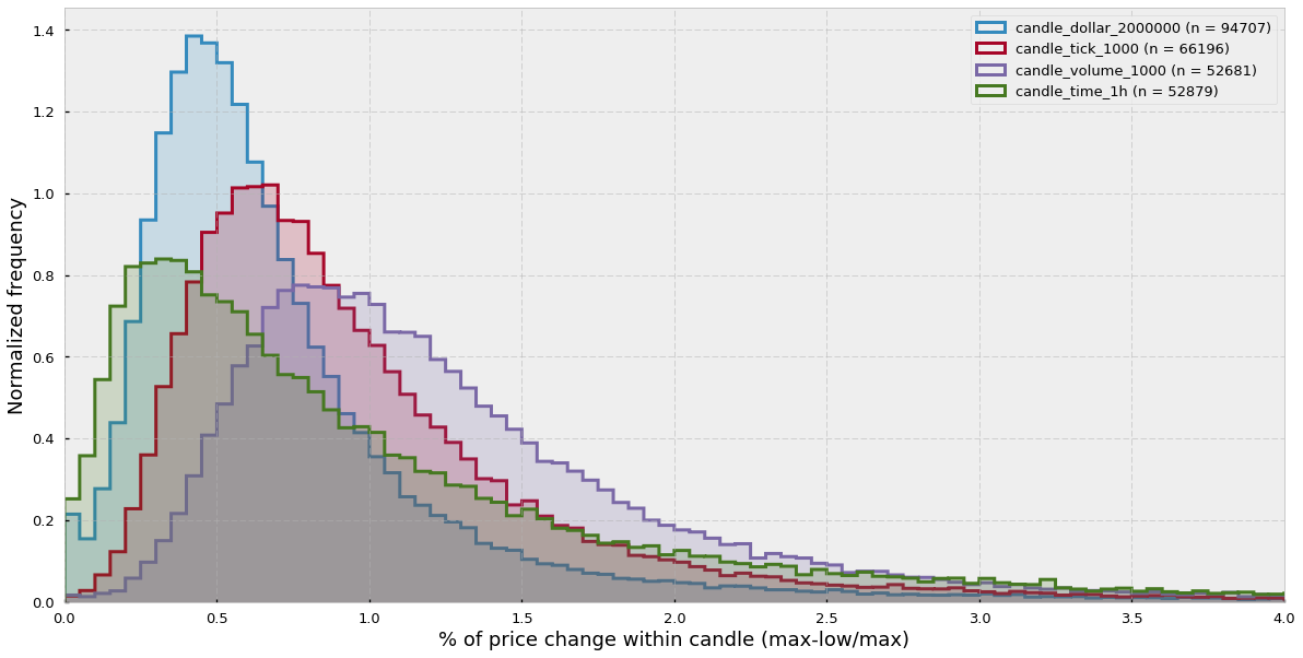
We can see that the time-candlesticks distribution is more displaced towards the 0 and has a long tail to the right, while the other distributions effectively sample more in periods of high price variation.
Daily bar frequency
Here I would like to look at the daily frequency of bars and how the price of the traded asset and the activity in the market affect the sampling rate. Let’s see the results:
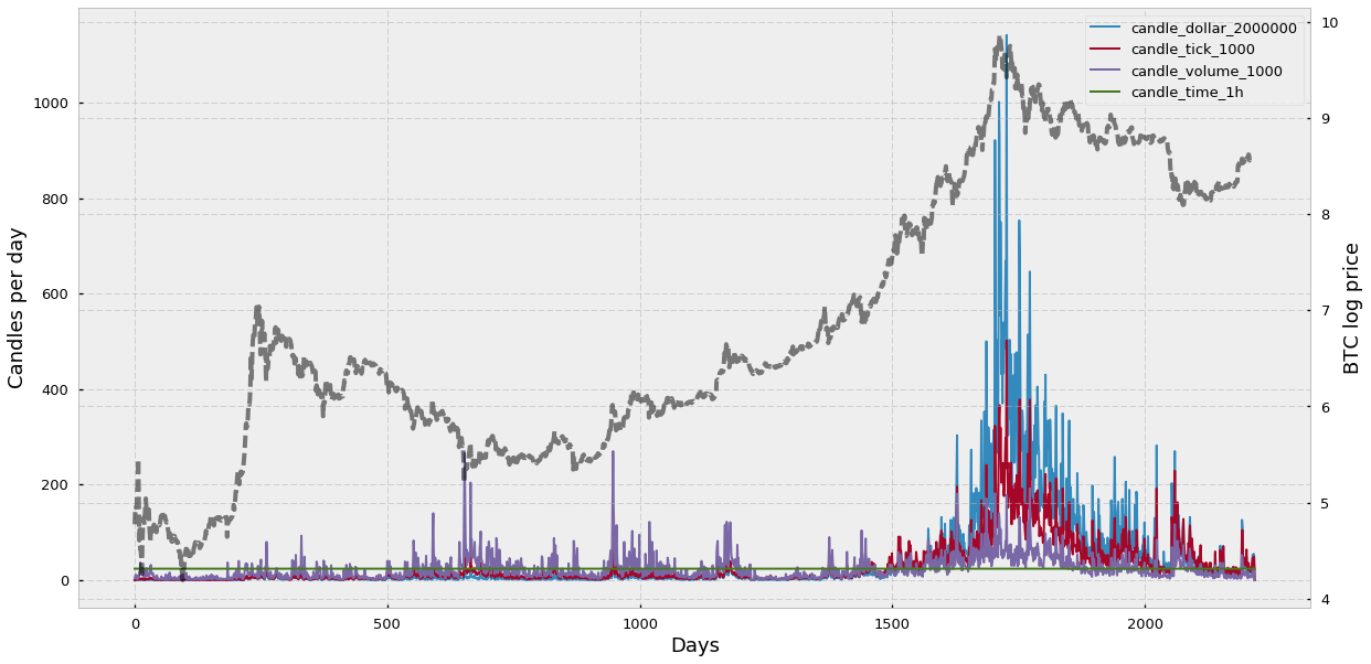
We can see that the time-based candlesticks are sampled at the same rate (24 bars per day) and that the sampling rate of the alternative bars varies according to changes in the bitcoin price (shown in grey).
Interestingly, among the alternative bars, volume bars sampling frequency seems to remain the most stable across all BTC-USD history — only if we include the all-time-high of 2017, otherwise dollar or tick bars seem to be more stable. Another feature that surprises me is that dollar candles, which are supposed to be more stable because they sort of “correct” for the actual asset price, seem to get out of control during the all-time high of 2017. I suspect that this is because dollar bars work well at correcting revaluations of the asset during more or less stable volumes. However, if you combine the fact that the asset price gets multiplied 10 times or more and the total volume, instead of decreasing due to the high cost of the asset, keeps increasing, then you encounter a situation when dollar bar sampling simply explodes.
What have we learned in this section?
- Volume bars address the tick bars limitation regarding multiple low-sized trades and iceberg orders by only focusing on the total amount of assets exchanged.
- Dollar bars measure the fiat value exchanged, which ideally corrects for the fluctuating value of an asset such as in cryptocurrencies.
- Both volume and dollar bars sample more when activity in the market increases and sample less when activity decreases.
- Volume bars display generally lower serial correlation than traditional time-based candlesticks.
- Dollar bars do not seem to yield a lower serial correlation. However, keep in mind that the number of dollar bars seemed to explode during the all-time-high, which means that most dollar bars probably come from a very short period of time and therefore average autocorrelation may be higher simply because of the close “adjacency” of the bars.
- Both volume and dollar bar log-returns do not follow a Gaussian distribution.
- The intra-candle variation distribution of traditional candlesticks seems to be displaced towards the zero and presents a long tail, which confirms their inability to adapt sampling to the market activity. Alternatively, tick, volume, and dollar bars intra-candle variation distributions appear more balanced and displaced towards the right.
- Volume bars sampling rate seems to be the most stable after fix-period time-based candlesticks.
- Dollar bars sampling rate seems to explode in bubbles with remarkably high volume.
Information-driven bars for financial machine learning: imbalance bars
In previous sections, we talked about tick bars, volume bars, and dollar bars, alternative types of bars which allow market activity-dependent sampling based on the number of ticks, volume, or dollar value exchanged. Additionally, we saw how these bars display better statistical properties such as lower serial correlation when compared to traditional time-based bars. In this section, we will talk about information-driven bars and specifically about imbalance bars. These bars aim to extract information encoded in the observed sequence of trades and notify us of a change in the imbalance of trades. The early detection of an imbalance change will allow us to anticipate a potential change of trend before reaching a new equilibrium.
The concept behind imbalance bars
Imbalance bars were firstly described in the literature by Lopez de Prado in his book Advances in Financial Machine Learning (2018). In his own words:
The purpose of information-driven bars is to sample more frequently when new information arrives to the market. By synchronizing sampling with the arrival of informed traders, we may be able to make decisions before prices reach a new equilibrium level.
Imbalance bars can be applied to tick, volume, or dollar data to produce tick (TIB), volume (VIB), and dollar (DIB) imbalance bars, respectively. Volume and dollar bars are just an extension of tick bars so in this article we will focus mainly on tick imbalance bars and then we will briefly discuss how to extend them to handle volume or dollar information. The main idea behind imbalance bars is that, based on the imbalance of the sequence of trades. we generate some expectation or threshold and we sample a bar every time the imbalance exceeds that threshold/expectation. But how do we calculate the imbalance? And how do we define the threshold? Let’s try to answer these questions.
What is tick imbalance?
Given a sequence of trades, we apply the so-called tick rule to generate a list of signed ticks (bt). You can see the tick rule in Formula 1. Essentially, for each trade:
- if the price is higher than in the previous trade, we set the signed tick as 1;
- if the price is lower than in the previous trade, we set the signed tick as -1;
- if the price is the same as in the previous trade, we set the signed tick equal to the previous signed tick.
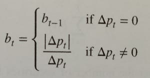
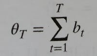
By applying the tick rule we transform all trades to signed ticks (either 1 or -1). This sequence of 1s and -1s can be summed up (cumulative sum) to calculate how imbalanced is the market (Formula 2) at any time T.
The intuition behind the signed tick imbalance is that we want to create a metric to see how many trades have been done towards a “higher price” direction (+1) or towards a “lower price” direction (-1). In the tick imbalance definition we assume that, in general, there will be more ticks towards a particular up/down direction if there are more informed traders that believe in a particular direction. Finally, we assume that the presence of a higher amount of informed traders towards a particular direction is correlated with information arrival (e.g. favorable technical indicators or news releases) that could lead the market to a new equilibrium. The goal of imbalance bars is to detect these inflows of information as early as possible so we can be notified on time of a potential trading opportunity.
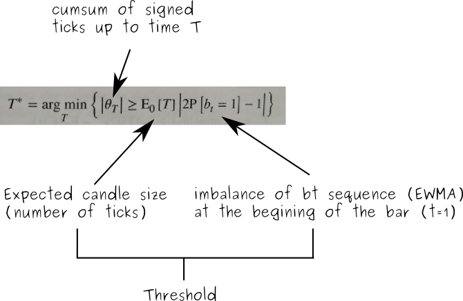
How do we set the threshold?
At the beginning of each imbalance bar, we look at the sequence of old signed ticks and we calculate how much the signed tick sequence is imbalanced towards 1 or -1 by calculating an exponentially weighted moving average (EWMA). Finally, we multiply the EWMA value (the expected imbalance) by the expected bar length (number of ticks) and the result is the threshold or expectation that our cumulative sum of signed ticks must surpass (in absolute value) to trigger the sampling of a new candle.
How do we define a tick imbalance bar?
In mathematical terms we define a tick imbalance bar (TIB) as a contiguous subset of ticks that satisfy the following condition:
A visual example
Let’s look at a visual example:
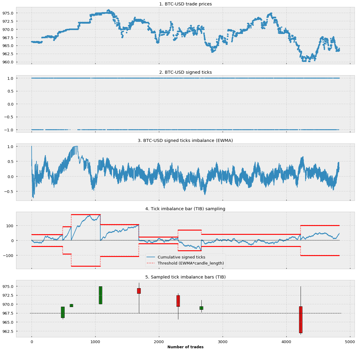
In Figure 1.1 you can see the price of approx. 5000 trades starting from 31–01–2017 for the BTC-USD pair in the Bitfinex exchange (source: CryptoDatum.io). In Figure 1.2 you can see how we applied the tick rule and transformed all the trades from 1.1. into signed ticks (1 or -1). Notice that there are more than 5000 signed ticks and most of the time they overlap with each other. In Figure 1.3 we applied an exponential weighted moving average (EWMA) to the whole sequence of signed ticks. We can observe how the resulting EWMA is a stochastic oscillating wave between -1 and 1 that indicates the general trend/frequency of positive and negative signed ticks. In Figure 1.4. we show, in red, the threshold or expectation as calculated in the last term of Formula 3. This threshold is calculated at the beginning of each bar. Notice that in the figure we show both the positive and negative threshold but, in practice, since we use the absolute value (Formula 3), we only care about the positive one. In blue, we show the cumulative sum of signed ticks at each particular point in time. Notice that the cumulative sum oscillates until reaching the lower or upper threshold, the point in which a new candle is sampled, the cumulative sum is reset to 0 and a new threshold (expectation) is calculated based on the EWMA imbalance at that particular point. Finally, in Figure 1.5 we represent the generated tick imbalance bars.
Implementation and observations
If you followed the explanation above, you may be wondering about:
- Concrete implementations of the TIB.
- How to calculate the “expected candle size”.
To answer question 1, please refer to this GitHub issue, as well as the parent repository. They offer good starting content to understand and implement tick imbalance bars in Python but beware of errors and different interpretations of TIBs.
In the same GitHub issue, question 2 is thoroughly discussed. The official definition by Lopez de Prado states that the expected candle size, much like the “expected imbalance” at time t=1, should be calculated as an EWMA of T values of previous bars. However, in my experience, and like other people in the thread, the sizes of the bars end up exploding (very big sizes of thousands of ticks) after a few iterations. The reason is simple: as a threshold grows, it takes more and more signed ticks to reach the threshold which, in turn, makes the “expected candle size” grow in a positive-feedback loop that keeps increasing the candle size until infinity. I have tried different solutions to fix this issue: (1) limiting the max. candle size and (2) fixing the candle size. It turns out that limiting the max candle size to, for instance, 200 makes all expected candle sizes become 200 after a few iterations. Therefore, both solutions work indistinctly, and following Occam’s razor principle I went for the simplest one (solution 2). Now the candle size becomes a variable to take into account, in CryptoDatum.io we decided to offer tick imbalance bars for three different candle sizes: 100, 200, and 400.
The way I interpret thresholds and these candle sizes are in terms of a “challenge”. Every time you set a new expectation/threshold at the beginning of a bar, we are challenging the time series to exceed our expectations. In these “challenges”, the candle size becomes one more parameter that allows us to specify “how big” we want this challenge to be. If we pick a larger candle size, we are essentially increasing the “challenge” difficulty and, as a result, we will end up with a lower amount of bar sampling although, in principle, with higher meaningfulness.
Volume and Dollar imbalance bars
Up to now we only talked about tick imbalance bars. It turns out that generating volume and dollar bars is trivial and it just involves adding a final multiplication term in Formula 2: either the volume (in case of volume imbalance bars — VIB) or the dollar/fiat value (in case of dollar imbalance bars — DIB).
Statistical properties
As we did with tick, volume, and dollar bars, we will look at two statistical properties: (1) serial correlation and (2) normality of returns. We will analyze the first one by running the Pearson correlation test of the shifted series (shift=1) and we will analyze the latter by running the Jarque-Bera test of normality.
Let’s look at the Pearson correlation test:
Similar to other alternative bars (tick and volume bars) the overall auto-correlation is lower in imbalance bars than in traditional time-based candlesticks. As we have seen before, this is a good feature because it means data points are more independent of each other. Now let’s look at the Jarque-Bera normality test:
We reject the null hypothesis of normality in both imbalance bars and time-based bars. For good or for bad this does not come as a surprise as the results are in line with what we saw in the previous sections.
What have we learned in this section?
- Imbalance bars are generated by observing the imbalance of the asset price.
- The imbalance is measured by the magnitude of the cumulative sum of signed ticks.
- Signed ticks are computed by applying the tick rule.
- Bars are sampled every time the imbalance exceeds our expectations (calculated at the beginning of each bar).
- The objective of imbalance bars is to early detect a shift in the directionality of the market before a new equilibrium is reached.
- Imbalance bars display lower autocorrelation compared to traditional time-based candlesticks and non-normality of results.
Python Implementations
Motivation
Although it may seem intuitive to work with price observations at fixed time intervals, e.g. every day/hour/minute/etc., it is not a good idea. Information flow through markets is not uniformly distributed over time, and there are some periods of heightened activity, e.g. in the hour following the market open, or right before a futures contract expires.
We must aim for a bar representation in which each bar contains the same amount of information, however, time-based bars will oversample slow periods and undersample high activity periods. To avoid this problem, the idea is to sample observations as a function of market activity.
Setup
Using a trade book dataset, we will construct multiple types of bars for an actual financial instrument. I will use the data for BitCoin perpetual swap contract listed on BitMex as XBT, because talking about BitCoin is an exciting thing to do these days and also because the trade book data is available here. We will compare time bars vs. tick bars, volume bars, dollar bars, and dollar imbalance bars. Python 3 snippets are provided to follow along.
First, a bit of setup:
import numpy as np
import pandas as pd
import matplotlib.pyplot as plt
import matplotlib.dates as mdates
from datetime import datetime# raw trade data from https://public.bitmex.com/?prefix=data/trade/
data = pd.read_csv(‘data/20181127.csv’)
data = data.append(pd.read_csv(‘data/20181128.csv’)) # add a few more days
data = data.append(pd.read_csv(‘data/20181129.csv’))
data = data[data.symbol == ‘XBTUSD’]
# timestamp parsing
data[‘timestamp’] = data.timestamp.map(lambda t: datetime.strptime(t[:-3], “%Y-%m-%dD%H:%M:%S.%f”))
Time Bars
We’ve now loaded a few days’ worth of trade data for the XBTUSD ticker on BitMex. Let’s see what the volume-weighted average price looks like when computed in 15-minute intervals. As previously mentioned, this representation isn’t synchronized to market information flow — however, we will use it as a benchmark to compare against.
def compute_vwap(df):
    q = df['foreignNotional']
    p = df['price']
    vwap = np.sum(p * q) / np.sum(q)
    df['vwap'] = vwap
    return dfdata_timeidx = data.set_index('timestamp')
data_time_grp = data_timeidx.groupby(pd.Grouper(freq='15Min'))
num_time_bars = len(data_time_grp) # comes in handy later
data_time_vwap = data_time_grp.apply(compute_vwap)
Note that we saved the number of bars in the final series. For comparing different methods, we want to make sure that we have roughly the same resolution so that the comparison is fair.
Tick Bars
The idea behind tick bars is to sample observations every N transaction, aka “ticks”, instead of fixed time buckets. This allows us to capture more information at times when many trades take place, and vice-versa.
total_ticks = len(data)
num_ticks_per_bar = total_ticks / num_time_bars
num_ticks_per_bar = round(num_ticks_per_bar, -3) # round to the nearest thousand
data_tick_grp = data.reset_index().assign(grpId=lambda row: row.index // num_ticks_per_bar)data_tick_vwap =  data_tick_grp.groupby('grpId').apply(compute_vwap)
data_tick_vwap.set_index('timestamp', inplace=True)
How does this compare to the time bar series?
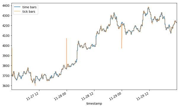
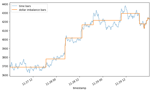
Plotting the two together, you may notice a flash rally and a flash crash (yellow) of ~10% that were hidden in the time bar representation (blue). Depending on your strategy, these two events could mean a huge trading opportunity (mean reversion) or a trading cost (slippage).
Volume Bars
One shortcoming of tick bars is that not all trades are equal. Consider that an order to buy 1000 contracts is executed as one transaction, and 10 orders for 100 contracts will count for 10 transactions. In light of this somewhat arbitrary distinction, it may make sense to sample observations for every N contract exchanged independent of how many trades took place. Since XBT is a BTC swap contract, we will measure the volume in terms of BTC.
data_cm_vol = data.assign(cmVol=data['homeNotional'].cumsum())
total_vol = data_cm_vol.cmVol.values[-1]
vol_per_bar = total_vol / num_time_bars
vol_per_bar = round(vol_per_bar, -2) # round to the nearest hundreddata_vol_grp = data_cm_vol.assign(grpId=lambda row: row.cmVol // vol_per_bar)data_vol_vwap =  data_vol_grp.groupby('grpId').apply(compute_vwap)
data_vol_vwap.set_index('timestamp', inplace=True)
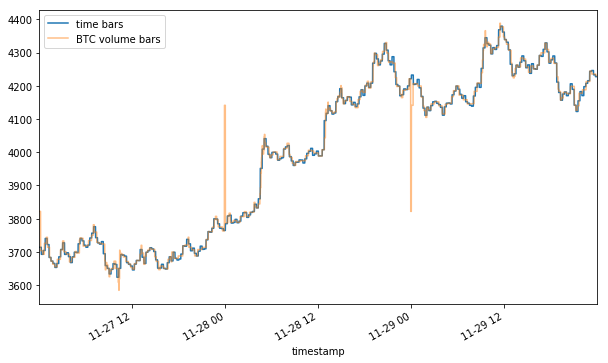
Note that the volume representation shows an even sharper rally and crash than the tick one (4100+ vs 4000+ peak and ~3800 vs 3900+ trough). By now it should become apparent that the method of aggregation chosen for your bars can affect the way your data is represented.
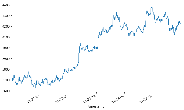
Dollar Bars
Even with the tiny dataset used here, you might notice that sampling the data as a function of the number of BTC traded doesn’t make sense when the value of BTC relative to USD moves more than 20% in just 3 days. Buying 1 BTC on the morning of 11–27 was a significantly different decision than buying 1 BTC on the night of 11–29. Such price volatility is the rationale behind dollar bars — sampling as a function of dollars (or a currency of your choice) exchanged should in theory make the frequency more robust to value fluctuations.
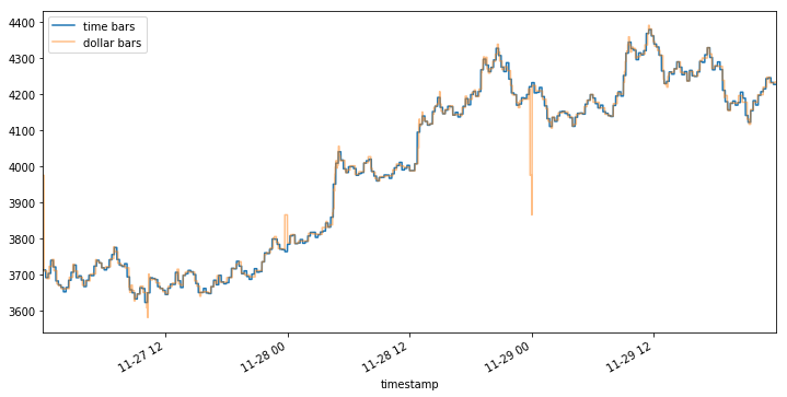
Note that the BTC volume bars show nearly identical jumps around 11–28 00 and 11–29 00, however, the initial spike in dollar bars on 11–28 00 looks relatively mild compared to the latter one.
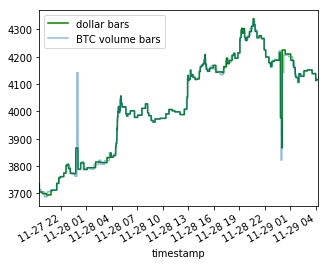
This is a prime example of differences induced by sampling — even though many bitcoins have changed hands around 11–28 01, their dollar value was relatively lower at that time and so the event is represented as less severe.
Imbalance bars
In a few words, to build this kind of bar we assume that tick imbalance represents informed trading (tick imbalance will be defined soon). So, whenever we observe an unexpected amount of imbalance we sample market prices and create a new bar. Using De Prado’s words:
The purpose of information-driven bars is to sample more frequently when new information arrives to the market. In this context, the word “information” is used in a market microstructural sense. […] By synchronizing sampling with the arrival of informed traders, we may be able to make decisions before prices reach a new equilibrium level.
The definition in AFML
Consider a sequence of ticks {(p_t, v_t)} for t=1, …, T, where p_t and v_t represent price and volume at time t. The tick-rule defines a sequence of tick signs {b_t} for t=1, …, T where b_t can either be 1 or -1.
Next, the tick imbalance can be defined as a partial sum of tick signs over T ticks.
Now, we should sample bars whenever tick imbalances exceed our expectations. This means we must compute a running imbalance for each bar and compare it with our expectations. We will close the bar when the absolute value of the current imbalance is greater than the absolute expected imbalance.
The book defines the expected imbalance at the beginning of each bar as the product between the expected number of ticks per bar (T) and the unconditional expectation of the tick sign (b_t). Furthermore, the book states that we can estimate these moments using exponentially weighted moving averages (EWMAs).

In particular:
- we can estimate the expected number of ticks per bar using an EWMA of the actual number of ticks T of previous bars
- we can estimate the unconditional expectation of the tick sign using an EWMA of the tick signs of the previous ticks
Implementing Dollar Imbalance Bars
Implementing imbalance bars warrants a more detailed explanation. Given dollar volume and prices for each tick, the process is:
- Compute signed flows:
- Compute tick direction (the sign of change in price).
- Multiply tick direction by tick volume.
2. Accumulate the imbalance bars :
- Starting from the first data point, step through the dataset and keep track of the cumulative signed flows (the imbalance).
- Take a sample whenever the absolute value of imbalance exceeds the expected imbalance threshold.
- Update the expectations of the imbalance threshold as you see more data.
Let’s expand each of these steps further.
1.1 Compute tick direction:
Given a sequence of N ticks { (p[i], v[i]) } for i ∈ 1…N where p[i] is the associated price and v[i] is the dollar volume, we first compute change in price from tick to tick, and then define the sequence {b[i]} for i ∈ 1…N:
Δp[i] := p[i]-p[i-1]
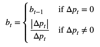
b[i] := b[i-1] if Δp[i] = 0
b[i] := sign(Δp[i]) otherwise
Luckily in our dataset, the tick directions are already given to us, we just need to convert them from strings to integers.
def convert_tick_direction(tick_direction):
    if tick_direction in ('PlusTick', 'ZeroPlusTick'):
        return 1
    elif tick_direction in ('MinusTick', 'ZeroMinusTick'):
        return -1
    else:
        raise ValueError('converting invalid input: '+ str(tick_direction))data_timeidx['tickDirection'] = data_timeidx.tickDirection.map(convert_tick_direction)
1.2 Compute signed flows at each tick:
Signed Flow[i] := b[i] * v[i] is the dollar volume at step I
data_signed_flow = data_timeidx.assign(bv = data_timeidx.tickDirection * data_timeidx.size)
2. Accumulate dollar imbalance bars
To compute dollar imbalance bars, we step forward through the data, tracking the imbalance since the last sample, and take a sample whenever the magnitude of the imbalance exceeds our expectations. The rule is expanded below.
Sample bar when:
|Imbalance| ≥ Expected imbalance
where
Exp. imbalance:= (Expected # of ticks per bar) * |Expected imbalance per tick|
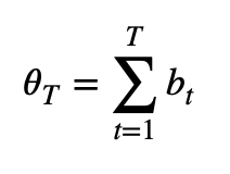
We define the imbalance for a subset of t ticks as θ[t] := ∑ b[i] * v[i] for i∈1…t
Let T denote the number of ticks per bar, which is not constant. Then, Eₒ[T] is the expected number of ticks per bar, which we estimate as to the exponentially weighted moving average of T values from prior bars.
Finally, we estimate the expected imbalance per tick, Eₒ[b*v], as the exponentially weighted moving average of b[i]*v[i] values from prior bars.
Putting it all together, we must step iterate over the dataset, and take samples every T* ticks, defined as
T* := argmin( t ) s.t. |θ[t]| ≥ Eₒ[T] * |Eₒ[b*v]|
Important caveats of this procedure:
- At the start, we don’t have any previous bars to base our estimates on, so we must come up with initial values for computing the first threshold.
- As the algorithm accumulates more bars, the EWMA estimates “forget” the initial values in favor of more recent ones. Make sure you set high enough initial values so that the algorithm has a chance to “warm-up” the estimates.
- The algorithm can be quite sensitive to the hyperparameters used for EWMA. Because there is no straightforward way to get the same number of bars as in the previous demos, we will just pick the most convenient/reasonable hyperparameters.
With that in mind, let’s put the logic into code. I use a fast implementation of EWMA sourced from StackExchange.
from fast_ewma import _ewmaabs_Ebv_init = np.abs(data_signed_flow['bv'].mean())
E_T_init = 500000 # 500000 ticks to warm updef compute_Ts(bvs, E_T_init, abs_Ebv_init):
    Ts, i_s = [], []
    i_prev, E_T, abs_Ebv  = 0, E_T_init, abs_Ebv_init

    n = bvs.shape[0]
    bvs_val = bvs.values.astype(np.float64)
    abs_thetas, thresholds = np.zeros(n), np.zeros(n)
    abs_thetas[0], cur_theta = np.abs(bvs_val[0]), bvs_val[0]    for i in range(1, n):
        cur_theta += bvs_val[i]
        abs_theta = np.abs(cur_theta)
        abs_thetas[i] = abs_theta

        threshold = E_T * abs_Ebv
        thresholds[i] = threshold

        if abs_theta >= threshold:
            cur_theta = 0
            Ts.append(np.float64(i - i_prev))
            i_s.append(i)
            i_prev = i
            E_T = _ewma(np.array(Ts), window=np.int64(len(Ts)))[-1]
            abs_Ebv = np.abs( _ewma(bvs_val[:i], window=np.int64(E_T_init * 3))[-1] ) # window of 3 bars    return Ts, abs_thetas, thresholds, i_sTs, abs_thetas, thresholds, i_s = compute_Ts(data_signed_flow.bv, E_T_init, abs_Ebv_init)
Let’s plot |θ[t]| and the imbalance threshold (Eₒ[T] * |Eₒ[b*v]|) to see what’s going on.
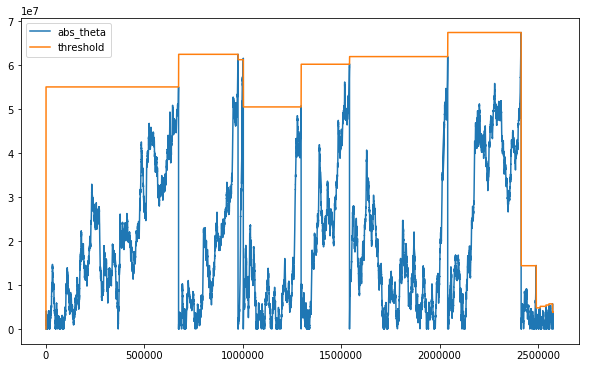
It seems like the sampling frequency is high near where the upward trend picks up and also near where that same trend reverses. Before we can visualize the bars, we need to group the ticks accordingly.
Aggregate the ticks into groups based on computed boundaries
n = data_signed_flow.shape[0]
i_iter = iter(i_s + [n])
i_cur = i_iter.__next__()
grpId = np.zeros(n)for i in range(1, n):
    if i <= i_cur:
        grpId[i] = grpId[i-1]
    else:
        grpId[i] = grpId[i-1] + 1
        i_cur = i_iter.__next__()
Putting it all together: Dollar Imbalance Bars
data_dollar_imb_grp = data_signed_flow.assign(grpId = grpId)
data_dollar_imb_vwap = data_dollar_imb_grp.groupby('grpId').apply(compute_vwap).vwap
We see that DIBs tend to sample when a change in trend is detected. It can be interpreted as DIBs containing the same amount of information about trend changes, which may help us to develop a model for trend following.
Review
Marcos Lopez De Prado points out that we should use the information clock to sample market prices. Tick Imbalance bars are just the simplest application of this concept and we should build on that to uncover interesting insights. We should come up with new definitions of information and expected information. After all, Marcos Lopez De Prado has just shown us the way and, probably, we should not take his implementation details too seriously. Why?
First of all, the proposed bar generating mechanism is heavily affected by how you initialize its parameters — to produce imbalance bars you must initialize the expected number of ticks per bar (init_T below), the unconditional expectation of the tick sign (E[b_t]) and the alphas that define the two exponential averages used to update our expectations.
The following plot represents results obtained with more than a thousand simulations. It shows that the number of bars produced for the same time interval decreases as the alpha that defines EWMA(T) increases. In addition, the number of bars decreases when we increase the value of T used to initialize the mechanism.
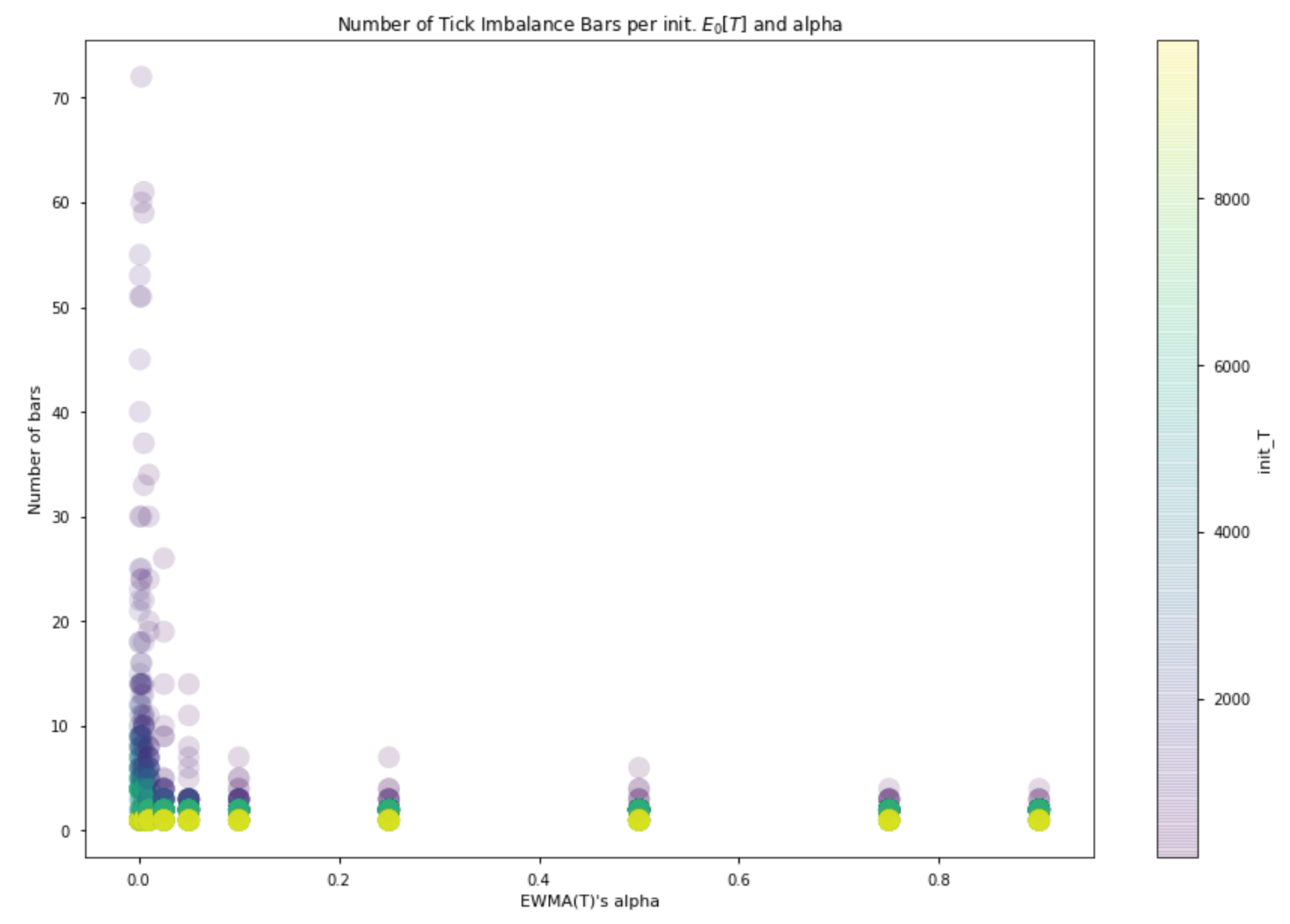
Naturally enough, the higher the number of resulting bars, the lower the amount of information we incorporate in each bar.
This means that when we choose how to initialize the bar generating mechanism we are roughly choosing the imbalance threshold we will use to close our bars.
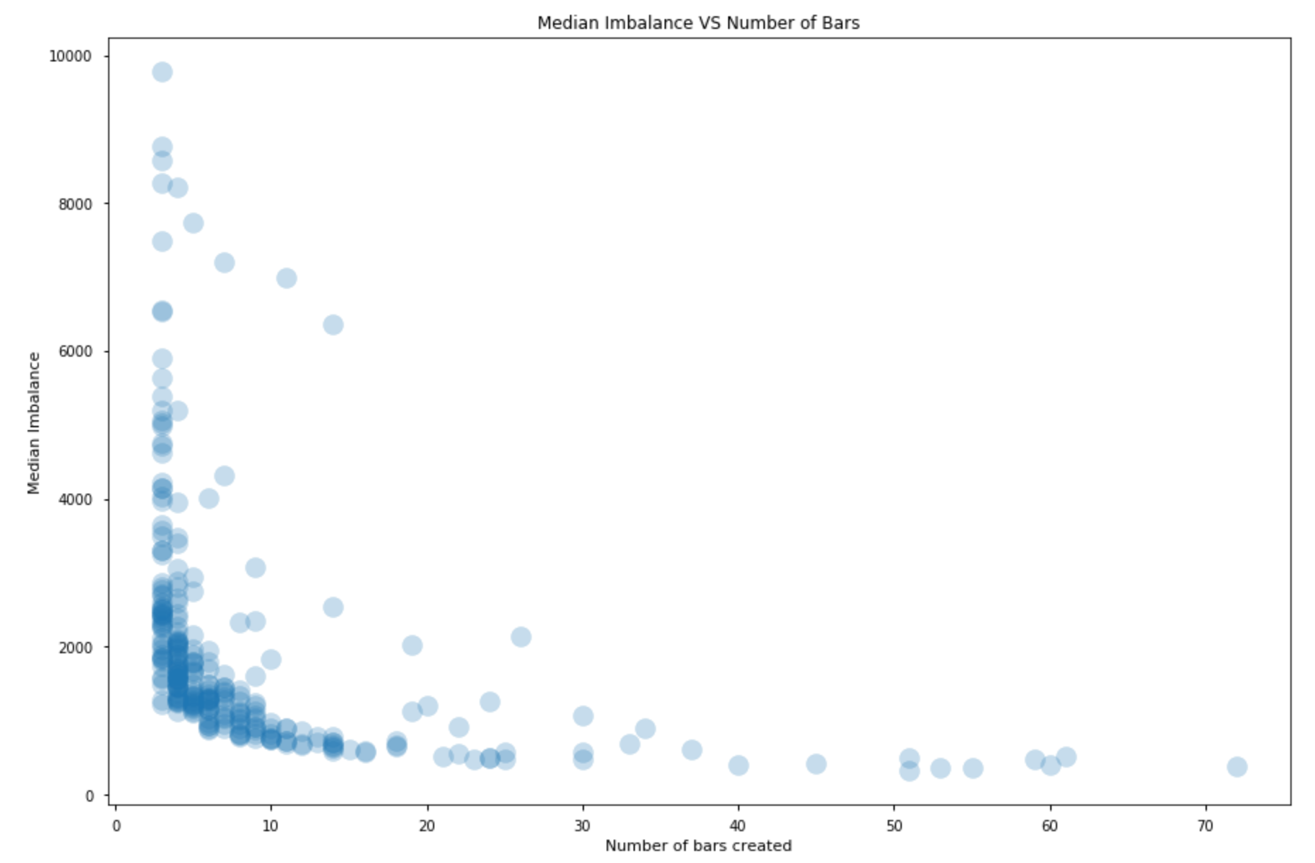
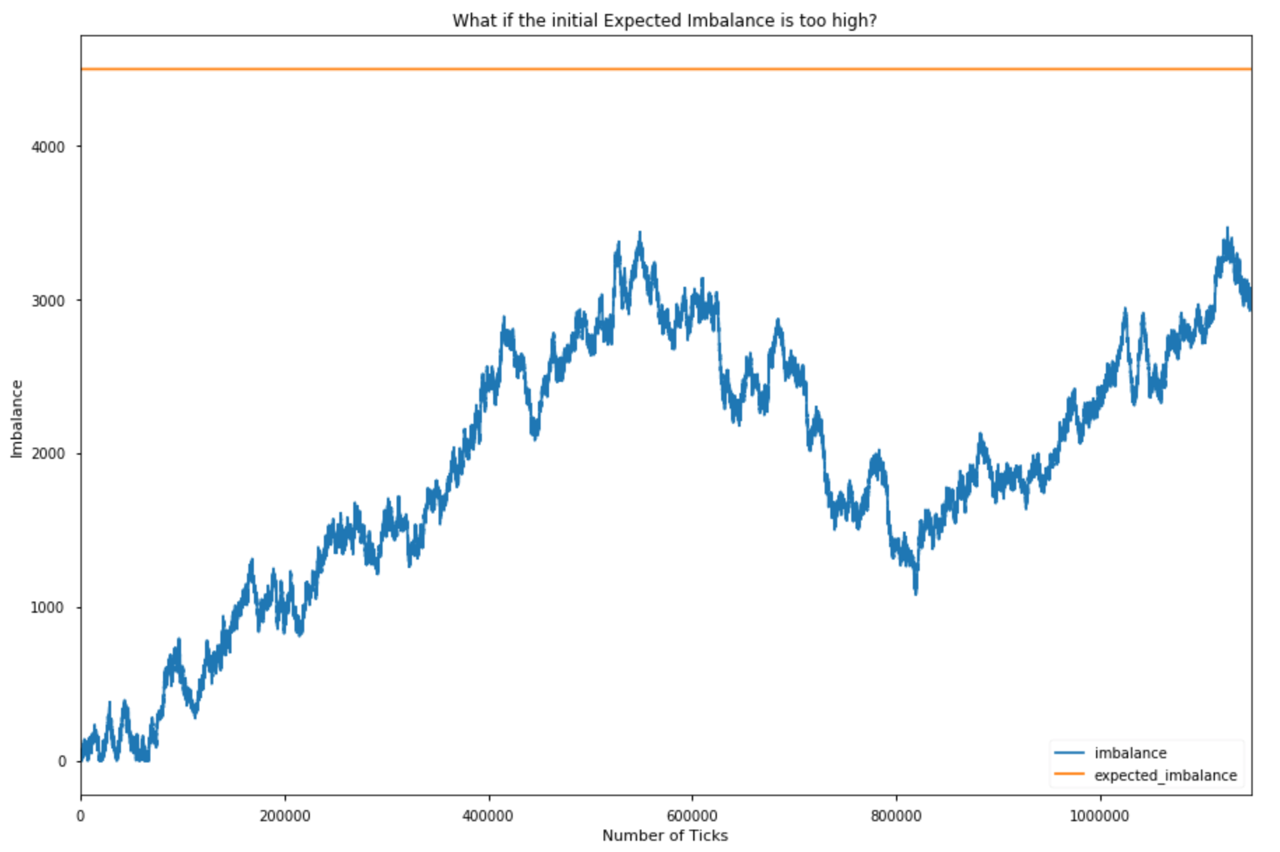
The plots above only showcase in which the mechanism produced at least 3 bars. It’s important to acknowledge that if the initialized expected imbalance is too high the mechanism will produce only a few bars or will even have a hard time generating a single bar; if it is too low we will instead produce too many bars. Our mechanism does not automatically adjust when your choice of initial parameters is completely wrong.
Secondly, although I like the idea that our expectations are dynamic, I do not really understand the suggested implementation. If we sample the market following AFML, we get heterogeneous bars: each bar has different information content. And this may be great but the point is that the amount of information we enclose in each bar and its dynamics are almost out of our control.
Have another look at the definition of expected imbalance above. The absolute value of the unconditional expectation of b_t can assume values in [0, 1] so what really defines the expected imbalance is the expected number of ticks. This means that the expected imbalance of the next bar could be higher (lower) if it took more (less) ticks to form the last bars. But how can you justify this idea? Why should your imbalance expectations increase if it just took a lot of ticks to reach the imbalance level you were expecting before closing the last bar?
The threshold at which you close a bar should be determined by other things. Ideally, I would like to close a bar when the current imbalance reaches a significant threshold, a threshold that tells me that prices will be somehow affected in the next X volume bars for example. Whether this significant threshold should be constant or not is a matter of research.
Summary
We’ve used a trade book dataset to compute time, tick, dollar, volume, and dollar imbalance bars on a BTC swap contract. Each alternative approach tells a slightly different story, and each has advantages that depend on the market microstructure and particular use cases. To represent financial time series you normally use bars, which are aggregations of ticks. But there are several ways to aggregate information; for this reason, many kinds of bars exist (time bars are the most common). Observe the market for 5 minutes, note down the first observed price (open), the lowest price (low), the highest price (high), and the price of the last tick that belongs to the chosen time interval (close) and you will have built a 5-minute bar!
However, markets, unlike humans, do not follow a time clock. They do not process information at constant time intervals. They rather do so event by event, transaction by transaction. So, what if we abandoned the time clock and started sampling market prices using a different logic? We could use the volume clock to build volume bars for example, or we could build tick bars and sample prices every time we observe a given amount of new transactions. Volume and tick bars are known sampling methods and I do not think they deserve an entire article as you can find plenty of information on the web. But, what happens if we use an information clock? What if we sampled prices every time an unexpected amount of information comes to the market? Well, this is precisely the idea behind information-driven bars. Interesting, isn’t it? We are going to introduce the simplest kind of information-driven bars: tick imbalance bars. Marcos Lopez De Prado presents them in his book Advances in Financial Machine Learning (AFML).
As Gerald Martinez wrote in his interesting article about imbalance bars, “the objective of imbalance bars is to early detect a shift in the directionality of the market before a new equilibrium is reached”.
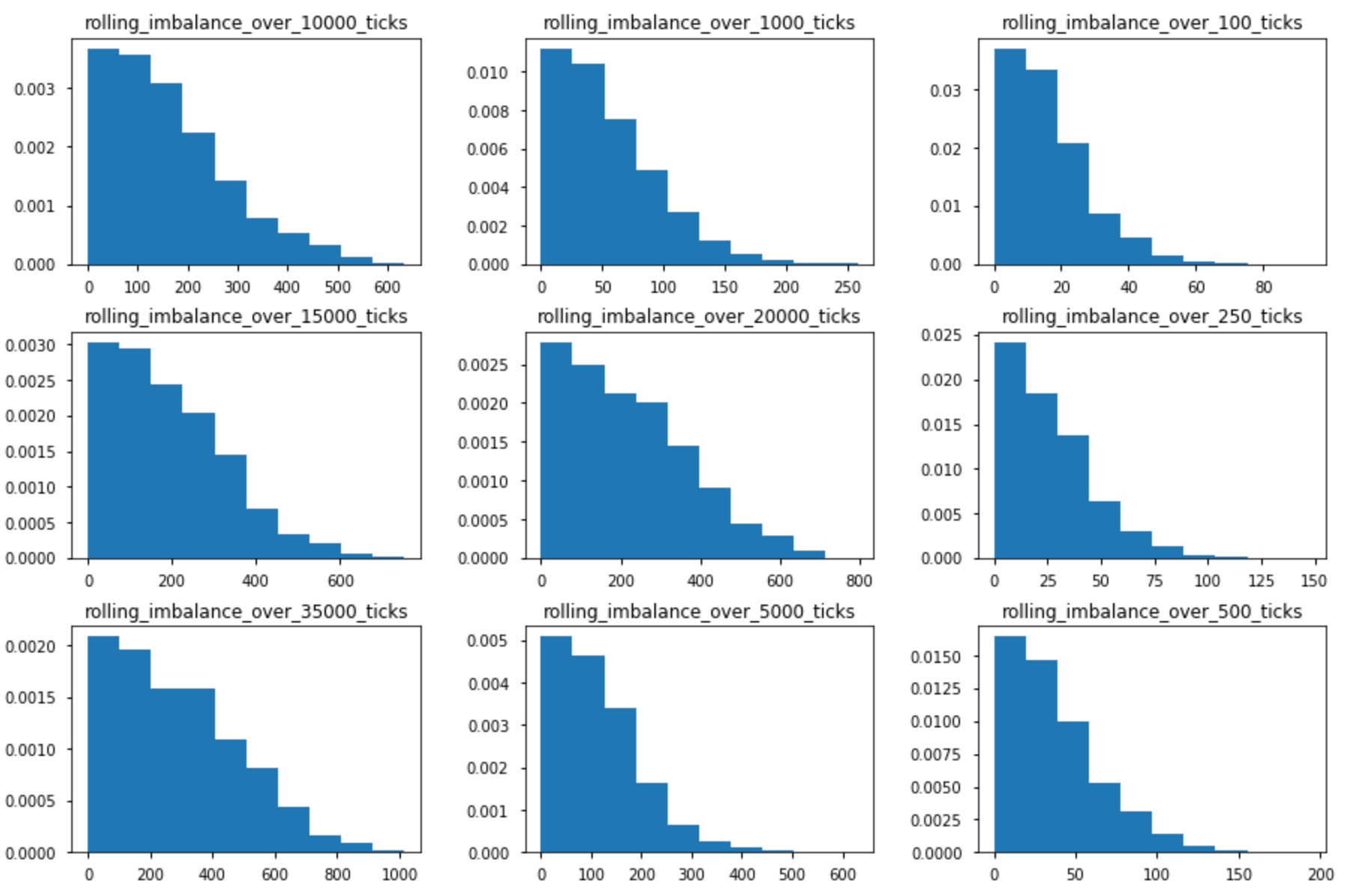
Bonus Section
The probability of achieving an imbalance level depends on the tick horizon (the number of ticks you are calculating your imbalance on). The plot below shows the empirical distributions of rolling imbalances for different tick horizons.
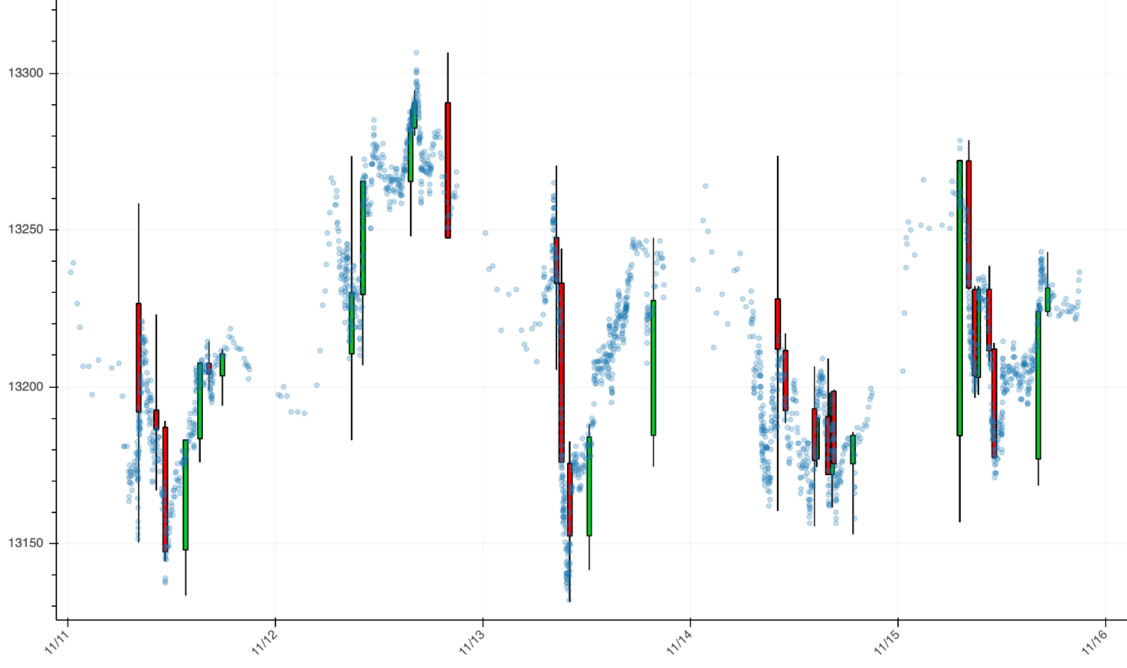
Below you find a plot of TIBs created with a constant expected imbalance paradigm. The blue dots are prices sampled with a volume clock.
Appendix and code
Every plot is based on tick data for the DAX futures contract with an expiration in December 2019. I used one month of ticks from 01/11/19 to 30/11/19. You may obtain different results with different data.
Below you find some spaghetti code to replicate my analysis and even create imbalance bars with your tick data. If you modify the spaghetti script a bit, you will be able to create bar ids using a constant expected imbalance paradigm.
# Imports
import itertools
import numpy as np

# Spaghetti function to create imbalance bar ids
def create_imbalance_bar_id(tick_imbalances, in_T, in_b, alpha, arrays=False):
    """
    :parameter: tick_imbalances: list of tick signs - either a +1 or a -1
    :parameter: in_T: initialization value for the expected number of ticks
    :parameter: in_b: initialization value for the expected imbalance
    :parameter: alpha: alpha to update the EWMA(T)
    :return: lists or numpy arrays if arrays=True
    """

    # Initialize expected imbalance
    expected_imbalance = in_T * in_b

    # Set a fixed value for ewma_bt
    ewma_bt = .005

    # Initialize ewmas
    ewma_T = in_T
    ewma_imbalance = in_b

    # Initialize tick count and current imbalance
    T = 0
    current_imbalance = 0
    bar_id = 1

    # Create lists to keep track of absolute current imbalances, expected imbalances per tick and bar ids
    abs_imbalances, expected_imbalances, bar_ids = [], [], []
    T_ewmas, imbalance_ewmas = [], []

    # Spaghetti loop
    for imbalance in tick_imbalances:

        T += 1
        current_imbalance += imbalance
        ewma_imbalance = ewma_bt * imbalance + (1 - ewma_bt) * ewma_imbalance

        # Save current imbalance ewma
        imbalance_ewmas.append(ewma_imbalance)

        bar_ids.append(bar_id)
        abs_imbalances.append(abs(current_imbalance))
        expected_imbalances.append(expected_imbalance)

        # Save current T ewma
        T_ewmas.append(ewma_T)

        if abs(current_imbalance) >= expected_imbalance:
            ewma_T = alpha * T + (1 - alpha) * ewma_T
            expected_imbalance = ewma_T * abs(ewma_imbalance)
            current_imbalance = 0
            T = 0
            bar_id += 1

    if arrays:
        return np.asarray(bar_ids), \
    np.asarray(abs_imbalances), \
    np.asarray(expected_imbalances), \
    np.asarray(imbalance_ewmas), \
    np.asarray(T_ewmas)

    # Otherwise return lists
    return bar_ids, abs_imbalances, expected_imbalances, imbalance_ewmas, T_ewmas

# Parameters to initialize
alphas = [0.001, 0.0025, 0.005, 0.01, 0.025, 0.05, 0.1, 0.25, 0.5, 0.75, 0.9]
init_T = list(range(100, 10000, 100))
init_b_t = [.5]

# Cartesian product of our lists of parameters
parameters = list(itertools.product(alphas, init_T, init_b_t))

"""
List of tick signs or even signed volumes if you like.
Something like [1, -1, 1, 1, 1, -1, ..., 1] -> I assume you are able to get some tick data and compute the tick sign
according to the well known tick rule.
"""
b_list = # Your list

# Dic with results
data = {"alpha": [],
       "init_T": [],
       "init_bt": [],
       "n_bars": [],
       "exp_imbalance_var": [],
        "min_exp_imbalance": [],
        "max_exp_imbalance": [],
        "median_exp_imbalance": [],
        "min_num_ticks_per_bar": [],
        "max_num_ticks_per_bar": [],
        "median_num_ticks_per_bar": []
       }

# Loop to create the data
for alpha, in_T, in_b in parameters:
    ids, _, expected_imbalances, _, _ = create_imbalance_bar_id(b_list, in_T, in_b, alpha, arrays=True)

    unique, counts = np.unique(ids, return_counts=True)

    data["alpha"].append(alpha)
    data["init_T"].append(in_T)
    data["init_bt"].append(in_b)
    data["n_bars"].append(len(unique))
    data["exp_imbalance_var"].append(np.var(expected_imbalances))
    data["min_exp_imbalance"].append(np.min(expected_imbalances))
    data["max_exp_imbalance"].append(np.max(expected_imbalances))
    data["median_exp_imbalance"].append(np.median(expected_imbalances))
    data["min_num_ticks_per_bar"].append(np.min(counts))
    data["max_num_ticks_per_bar"].append(np.max(counts))
    data["median_num_ticks_per_bar"].append(np.median(counts))
References:
https://towardsdatascience.com/financial-machine-learning-part-0-bars-745897d4e4ba
https://towardsdatascience.com/information-driven-bars-for-finance-c2b1992da04d
https://github.com/BlackArbsCEO/Adv_Fin_ML_Exercises/issues/1